You may have noticed that things look a little different around here. Today’s the day we finally get to flaunt our brand new design — and boy, are we feeling fine. We checked in with our very own Nazir Agah, who led the redesign initiative, for a look behind the logo. Enjoy, and let us know how you like our new style in the comments.
Why a redesign? Why now?
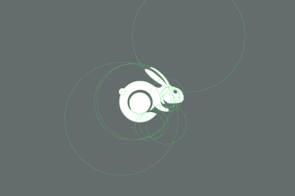
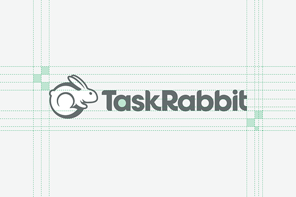
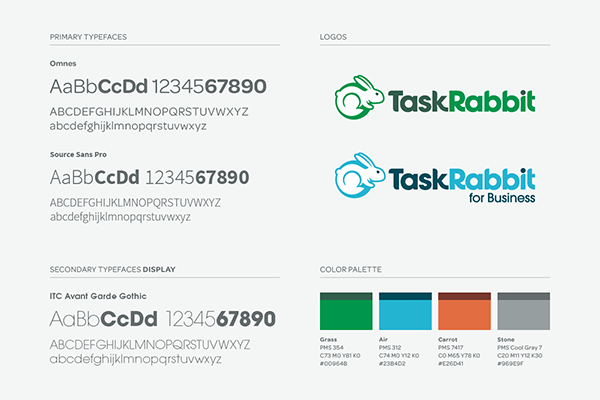
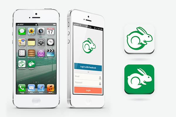
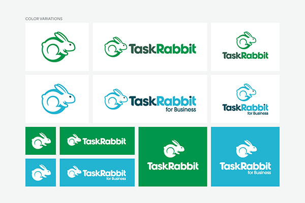
“We wanted to simplify. Not only has our B2B product, TaskRabbit for Business, experienced rapid growth, but we’ve also seen an increase in users accessing our product via mobile devices. We tried modifying the earlier rabbit logo mark with some success, but realized that we needed a heftier shift in identity expression. The old rabbit posed some technical barriers, including readability at small sizes. Since changing the rabbit is a pretty significant design decision, we decided to take the opportunity to take a critical look at our visual expression and reevaluate the design as a whole.”
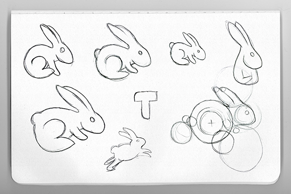
The TaskRabbit rabbit was already quite iconic, why the change and how did you approach redesigning a mascot that was already beloved?
“Part of the reasoning behind redesigning the rabbit came from customer feedback about how TaskPosters and TaskRabbits perceived the brand. We did some research to gather these learnings and determined it was time to redefine the principle meaning behind TaskRabbit to evoke impressions of professionalism while sustaining a friendly and familiar demeanor.”
Do you have a name for the rabbit?
“Not officially, but the TaskRabbit Design Team likes to call her Hazel.”
How did the design team at TaskRabbit work together on the new design identity?
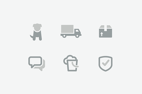
“We took a deep look at the brand components comprising TaskRabbit at the time and started there, refreshing the color palette and typeface choices. From there we started to assemble a library of iconography to replace the human characters and illustrations. Lastly, we tackled the logo as the cornerstone to our new aesthetic. You’ll see simplifications to our user experience design rolling out in the near future as well.”
How would you describe the feeling and aesthetic of the new identity?
“Energetic. Reliable. Trustworthy. Fun. Clean. Simple. Friendly. Quick.”
What will be the biggest challenge in implementing the new design?
“We have a unique opportunity to update the exterior window decal on the east side of our building. This facade overlooks the Bay Bridge as people drive into San Francisco from the East Bay, so it’s a very large visual touchpoint. And of course, integrating the colors, typefaces, and logo in a consistent manner across all online and offline collateral will be a challenge on its own.”